reframe
a non-profit that aims to reframe the narrative surrounding women’s menstrual and post-menstrual health and support them in their workplace(s).
the brief was to make something disruptive that gets people’s attention to change the stories society tells itself about women’s menstrual health and what that means in the workplace.
[concept - branding & visual identity]
the concept: What is it about women’s bodies that conversations around it are so hushed and shushed in so many societies? If we can’t talk openly about women’s bodies, dialogue surrounding their health is also censored and shushed. this concept embodies this unapologetic ownership of women’s bodies so we can finally move past “the secrecy” and change the narrative regarding their health.
1st execution: the brackets draw out the shape of the vulva, a bold and unapologetic representation of women’s bodies. this aligns perfectly with the mission to destigmatize conversations about women’s health.
the use of brackets symbolize a frame around the wordmark to mean “framing" while the inversion of the wordmark is meant to emphasize on the “re”framing part of it.
the soft, muted pink feels feminine but not cliché, adding a balance to the otherwise bold representation of women’s bodies.
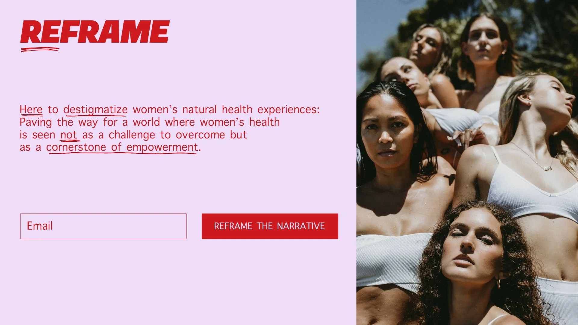
2nd execution: this concept boldly asks questions like: why are we not yet redefining how society talks about women's health? why should women have to overcompensate for or hide their needs?
it’s time we start rewriting - loudly - the narrative: advocating for systemic change and fostering an ecosystem, building a worldview where women’s health is seen not as a limitation but as a sign of their strength.
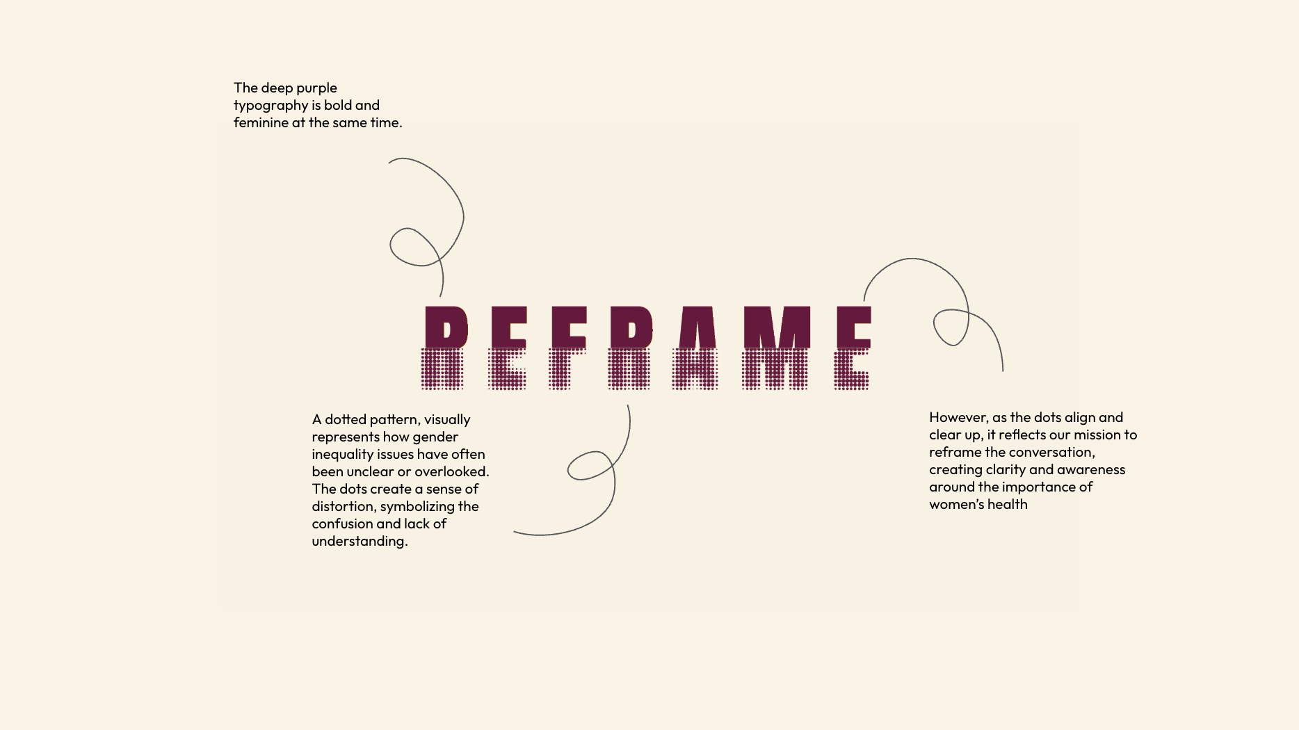
3rd execution: this concept aims to bring clarity to important topics regarding women’s health and say it how it is so we can advocate for better support for women’s health.
i aimed to visually represent how these issues have often been unclear or overlooked (in generally a male-dominated space, even today). the dots create a sense of distortion, symbolizing the confusion and lack of understanding . however, as it aligns and clears up, it reflects our mission to reframe the conversation, creating clarity and awareness around the importance of addressing women’s health.
4th execution: when narratives around women's health are blurry and distorted, we can only read just that view and shift focus to see things clearly - much like reframing outdated perspectives. just as a camera lens sharpens its focus, we are here to sharpen the world’s understanding of women’s health, breaking down stigmas and helping us see women’s lived-in experiences with clarity.


